
Year
June 2017 (5 months)
Client
British Business Bank
Role
UX Design
Designing a content hub which helps growing SMEs access external finance by educating, enabling and empowering them.
With SMEs accounting for over 99% of all UK businesses, their significance to the wider UK economy is unquestionable. With £5 million in growth loans & equity funding not being accessed, the British Business bank set a mission to encourage SMEs to apply for funding.

Project Goals
Drive awareness
of different finance options
Provide guidance
for growing SMEs & encourage action
Increase traffic
to finance partners website
Boost interest
in SMEs accessing equity finance
Increase quantity
of successful applications for business finance
Inspire trust
& drive awareness of the British Business Bank
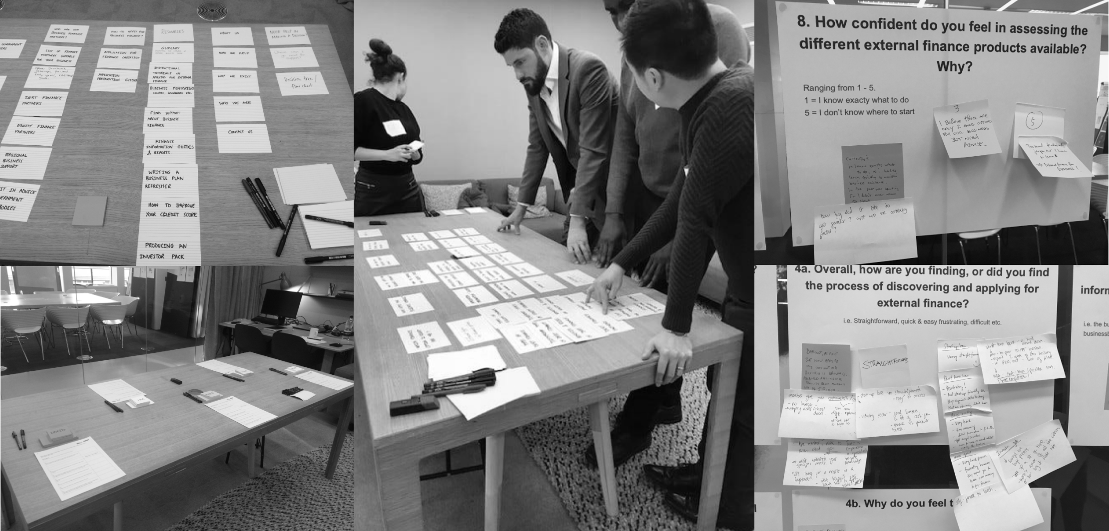
Discovery

STAKEHOLDER WORKSHOP
Facilitated an open card-sorting session with stakeholders

CARD SORTING
Facilitated both in-house and remote research & card sorting session with users

PERSONAS & JOURNEYS
Created various personas & user journeys
User Insights
1. Information on business finance is fragmented & overwhelming
2. Misunderstanding of equity finance
3. Waste time researching finance options their business isn’t eligible for
4. Relatively risk-averse, so tend to stick to the more secure & known options
5. Regional SMEs feel they have less opportunities than those in London
6. SMEs are sceptical of equity finance
7. Unaware of the range of finance options that are available to them
8. Lack of confidence if they were previously unsuccessful at obtaining finance
9. Lack of confidence with their financial abilities
10. Weary about where the information comes from

Define

SITE MAP
Collating insights from both the stakeholder workshop and user sessions.

PAGE PURPOSE
I defined the purpose and KPIs for each page within the website to gage the priority of importance.

XD PRINCIPLES
Along with the UX lead, I defined a set of XD principles for the website and content.

CONTENT/ToV
I consulted with the content strategist to ensure the content and tone of voice resonated with the user.
Information Architecture
Based on user expectations and needs of the business I organised the necessary content into groupings; the benefits of finance, information about the finance types, how to prepare and apply for them, where to acquire finance & where to get support.
However it became apparent that the business had a strong vision about what the website should be and offer, with a particular importance on highlighting ‘equity’ finance, and therefore we collaborated on the content, groupings and labels to go into user testing with. I included an ‘action’ word for each section to encourage the user to ‘do’ something; understand, get, search.

Design

WIREFRAMING
Designed and iterated upon desktop & mobile wireframes for the site, including the navigation schema.

PROTOTYPING
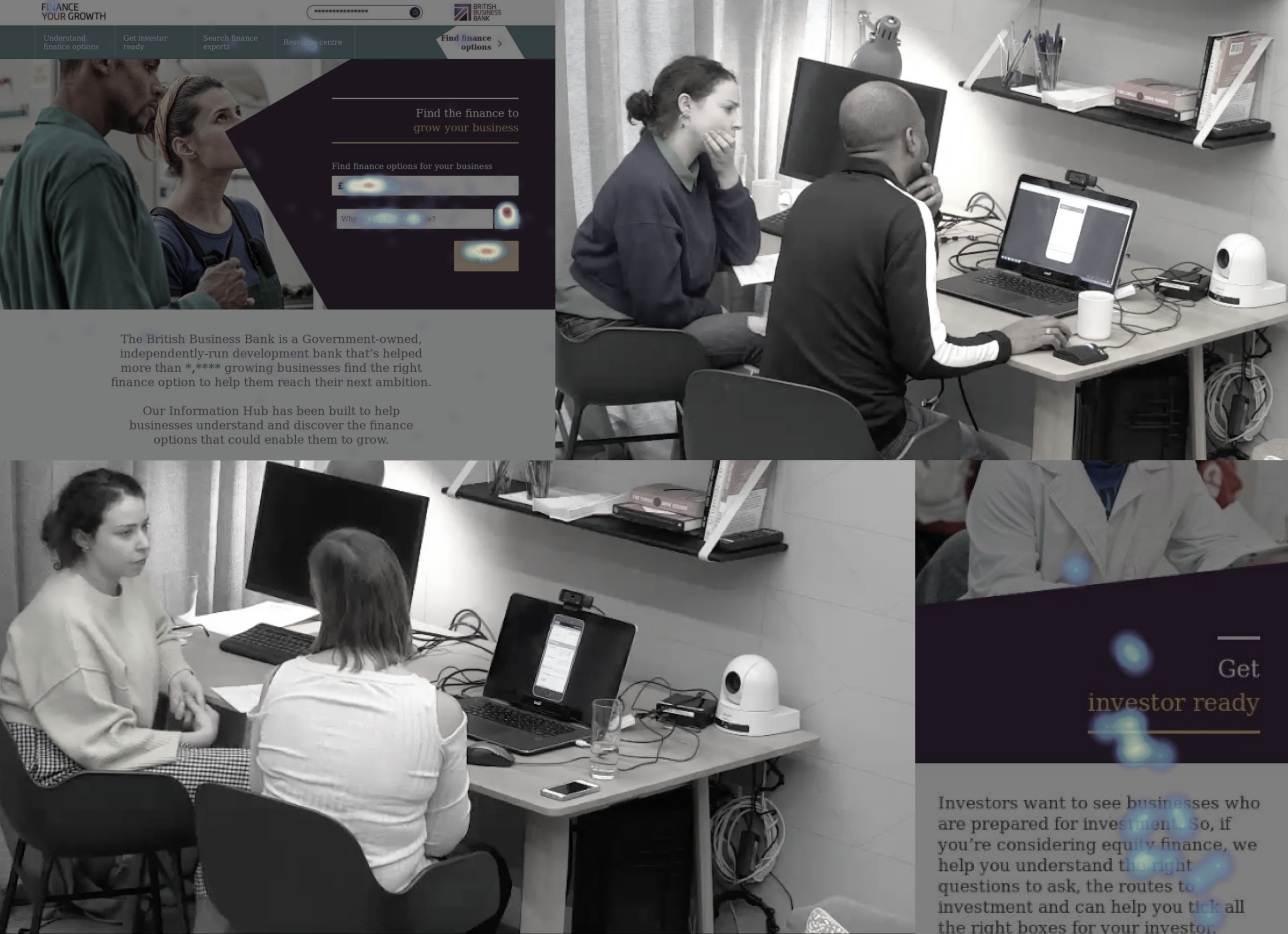
Prepared desktop & mobile Invision prototypes for user testing and for showcasing the designs to the stakeholders.
Based upon what I learnt during the discovery phase the website needed to cater to different customer needs; to educate, to guide, to inspire, to impart confidence, to reduce inertia and to drive action.
I created wireframes, presenting back to the business before and after testing the designs with the users.

Testing Insights
Two core CTAs on homepage
Originally there were two core sites on the homepage to cater to whether the user wanted to use filter finance options or undertake their own discovery. However the participants required one clear CTA so I amended it to the tool CTA only, which is a USP of the site. .
Adding tooltips to the questions
Participants did not always understand the questions or answer options of the tool questions and so I added explainer tooltips.
Colour coding the tool results
Participants did not immediately understand that the colour coding of the tool results implied with finance options were suitable or not suitable for them based upon their answers to the questions, so I iterated upon the designs.
Anchoring content
As the site was sometimes dense with information, participants responded well when there were anchoring links within the pages helping them get to the content relevant to them more efficiently.
From testing to design
Working alongside the UI designer and content strategist to deliver final designs, components & navigation based on client feedback, and user & testing insights.
Tool Questions
The tool enables users to filter out the options they aren’t eligible for, before investing time into understanding and applying for it. It provides feedback by showing them the number of options they are eligible for as they answer each question. The questions include tooltips for anyone who isn’t as familiar with the terminology or process of applying for finance.

Tool Results
The tool enables users to find the options most suitable to their business, ensuring there is no particular bias shown to any one type. It also provides top-line information on the different options, links to partner sites, and checklists for how to apply.

Help & Inspire
To aid and inspire users by showcasing success stories of other businesses, and accessible & action-led content such as checklists and tooltips

Educate & Engage
To provide educational content that’s easy to find (i.e. via a scrolling sidebar).

Illicit Trust in BBB
To be transparent that the BBB are non-partisan and unbiased towards particular finance types or partners, but still come across as credible experts in this field. This is done by clearly communicating who they are using accessible language, and validating via testimonials and content contributed by industry experts from credible bodies.

Guide users
To anticipate what the users are looking for and guide them helpfully through the website.

Deliver & Deploy

BUILD SPECS.
Behavioural and interactive specifications for the developers, and guidance for the content authors..

EVENT TAGGING
Working with the data analyst to identify the CTAs & engagement metrics to track in order to measure engagement & conversion.

MEASURE & LEARN
Working with Strategists to create a list of metrics to measure such as exit points & user satisfaction (NPS).

SITE TESTING
Undertook usability testing on the website several months after going live to learn what optimisations should be made.
Key Learnings
Challenge the brief
The brief was solution-first in order to solve a business problem, but through user research & testing I uncovered potential other problems which were more prevalent to the users needs.
Own the XD process
The clients were heavily involved with recruiting the participants for card sorting and user testing, resulting in several participants that they didn’t fit within the user criteria.
Collaborate as early and often as possible
Collaborating regularly with internal & external stakeholders and getting the right people in the room at the relevant time could have alleviated issues that arose, as well as managing stakeholder involvement, and made the XD team feel more in control.
Other projects

EON ENERGY
e-commerce component library

COSTA COFEE
website redesign (pitch)

NIKE
Aftercare service