Year
June 2019 (1 month)
Client
Lowell Financial
Role
UX Design
Enhancing customer engagement with a debt collection agency via welcome emails
The challenge is that debt collectors are unpopular and no one chooses Lowell. People go from dealing with debt via a company they know to being contacted by a debt collector they’ve likely never heard of and therefore instinctively mistrust.
The Results
+20%
Increase in users setting up a payment plan (on going live)
£££
Highest ever month of online collections (on going live)

Project Goals
Increase CTR
to Lowell Website
Increase engagement
with Lowell within the first 30 days
Increase amount
of debt collections
Improve perception
of the Lowell brand
Attitudes towards debt
1. Customers don’t trust debt collectors
2. Customers aren’t fully aware of the impact of their debt
3. Feel that repaying debt is an overwhelming or unending task
4. Feel embarrassed about their situation
5. Lack financial ability or are mentally vulnerable
6. Lack financial confidence and/or ability
7. Don’t understand the debt repayment process
Define

COMMUNICATION PLAN
Worked with an experience strategist, we defined the communications plan.

CONTENT/ToV
Alongside the strategist, we defined the content needed for communications and how we speak to the customers.
Delivering personalised communications
WHO WE SPEAK TO
Catering to 4 personas, based on willingness & ability to pay, as well as including 3 customer segments; New, known & current.
HOW WE CONTACT
As 40% of their customers had an unconfirmed email address, we needed to balance the communications using both SMS & email.
WHEN WE CONTACT
Using the behavioural principle of ‘fresh-start effect’, we decided to send them every Monday over a 30 day period (the highest time period of likely engagement).
WHEN WE STOP CONTACT
Being able to track when a customer takes an ‘action’ so we know to stop sending them the welcome comms.
WHAT WE SAY
That we applied the relevant content objectives, in the right tone of voice to the right customer at the right stage.
WHERE WE DIRECT TO
That the CTAs took the customer to the most relevant website page which was a natural continuation of the comms. content.

Design

WIREFRAME
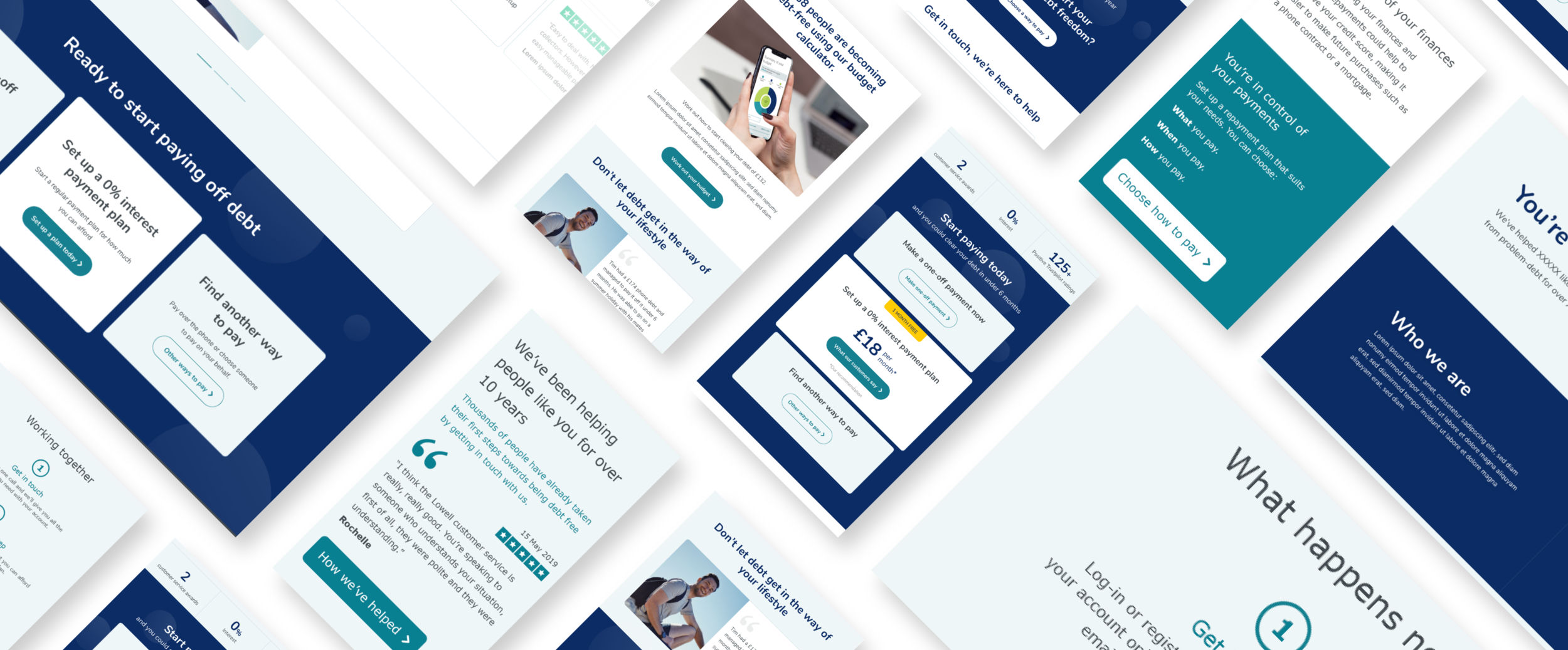
I produced the wireframes for the 3 welcome emails including copy to guide the writer on tone & intention.

DESIGN
Worked with the UI Designer & Content writer to bring the wireframes to life.
The design objectives are to LEGITIMISE Lowell as trustworthy & credible, EDUCATE customers on the impact debt has on them, ENCOURAGE & EMPOWER customers to start paying, NORMALISE debt, SUPPORT customers who can’t pay, DEMYSTIFY debt & debt collection & BE TRANSPARENT about the process of repaying debt.

#1 Legitimise Lowell
Was catered to all personas, intended to legitimise Lowell by promoting the benefits, customer testimonials and explaining the process. The intention was to avoid aggressive ‘pay us now’ messaging.

#2 Empower customers
Was catered to people who could and want to pay by promoting the budgeting tool and payment options.

#3 Support customers
Was catered towards the more vulnerable customers by normalising debt and providing support.

Optimise

FRAMEWORK
A strategy framework to identify what user & business data is needed to design personalised comms.
WIREFRAMES
Examples of how the strategy framework could be brought to life
DESIGN
Working with a UI & Motion Designer to update the brand visuals

SPECIFICATIONS
What requirements would be needed to deliver the ideal designs
Simultaneous to delivering the MVP welcome communications, the strategy team presented our ideal vision for the digital experience moving forward, which I contributed to. The vision was an application of Lowell’s brand pillars: Personalisation, Brand Salience, Behavioural Tactics & AI combined with our experience principles; Effortless, Simple, Predict & Pre-empt & Recognise Individuals.
The Framework & Brand pillars
I created a framework in order to communicate to the stakeholders what information would be required to input & output in order to implement the ideal digital customer experience. I also showed how the brand pillars were brought to life through the pages and listed the requirements for each feature.

Wireframes
I then applied this framework to welcome emails, highlighting how content could be tailored to the individual, based on what we would (ideally) know about them.

Advancing the Visual Identity
We also produced examples of where we could take the digital communications and website if we could introduce a slightly enhanced look & feel, as well as new components, without suggesting anything too far removed from their existing brand
The intention was to instil credibility, trust and calmness by choosing a ‘serene & trusting’ colour palette (blue), whilst using subtle motion to draw the user down the page and accent key content or CTAs. I worked with a UI & Motion designer to bring my wireframes to life.

Other projects

GREEN PARK CONTENT
User research

LOWELL FINANCIAL
Welcome communications

EON ENERGY
Website redesign